







Restyling 12+ Web Tools Without 12+ One-Off Stylesheets
Nineteen tools built independently over months, unified under one orange theme that still has to feel right on a calculator and a whiteboard alike.
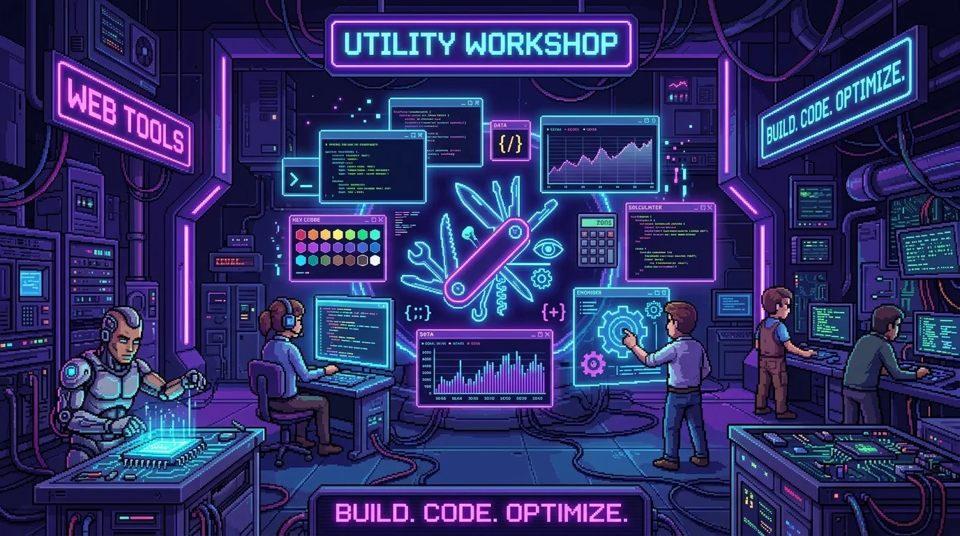
Every web tool is getting restyled to one shared orange theme, and I want to be upfront about the actual scale of this: Calculator, Color Picker, ASCII Art Generator, Password Generator, Random Generator, Subnet Calculator, Unit Converter, Duplicate Finder, Text Tools, Timer & Stopwatch, List Comparator, and QR Code Generator, all in the same pass. That's most of the tools catalog, restyled together rather than one at a time over weeks.
Nineteen tools built independently meant nineteen slightly different visual dialects
Every tool on this site was built on its own day, sometimes months apart, which meant each one had accumulated its own slightly different conventions — button styles, spacing choices, color usage that made sense in isolation but never had to agree with anything else. That's fine for a single tool used on its own. It's a problem the moment someone navigates between two tools in the same session and the visual language quietly shifts underneath them for no reason connected to what either tool actually does. Bringing all of them under one shared orange theme means that shift stops happening — the visual language stays consistent regardless of which specific tool someone happens to be using.
One shared theme, not nineteen one-off stylesheets
The tempting shortcut here would have been restyling each tool's existing one-off CSS file individually, tool by tool, matching the new orange palette without touching the underlying structure. I resisted that because it would have meant nineteen separate places still capable of drifting apart from each other again the moment any future style update happened — exactly the problem I was trying to fix in the first place. Building genuinely shared style patterns that every tool draws from, rather than nineteen independently maintained copies that happen to look similar today, means a future palette tweak reaches every tool simultaneously instead of needing nineteen separate edits that could easily fall out of sync with each other over time.
Orange had to work across genuinely different tool personalities
A calculator and a whiteboard and a password generator have almost nothing in common functionally, and finding one accent color treatment that reads as appropriate across all of them, without making a serious utility like the Subnet Calculator feel like it's wearing a playful color scheme mismatched to its purpose, took more care than picking a color usually does. Orange had to feel energetic enough for a creative tool like the Color Palette Generator while still reading as clean and trustworthy on something like Password Generator, where the tone needs to feel careful rather than playful. Getting one accent color to stretch across that whole range of tool personalities without feeling wrong on any single one of them was the actual design challenge, more than picking the hex value itself.
Unifying font choice meant touching every tool's typography at once
Beyond color, unifying the arcade font across every tool page meant reviewing typography choices tool by tool that had never been reviewed together before — heading sizes, label weights, how dense a results panel's text could get before it stopped being comfortably readable. Some tools had accumulated font choices that made sense in isolation but looked visually loud or cramped once placed side by side with the unified font applied consistently everywhere else. That review process surfaced small, unrelated legibility issues in a couple of tools that had nothing to do with the redesign itself, which is a nice, unplanned side benefit of forcing a close look at every single tool's UI in the same pass.
Tile artwork and favorite-star styling needed the same pass, not a separate one
Restyling the tools themselves without also refreshing their tile artwork and favorite-star icons in the web tools lobby would have left a visible seam — a newly orange-themed tool represented by an old tile that still reflects whatever visual era it was originally built in. Doing the lobby-facing artwork in the same pass as the tools themselves meant the whole experience, from spotting a tool in the grid to actually using it, feels like one continuous visual identity rather than a redesigned interior behind an unchanged storefront. That consistency between the lobby tile and the tool itself matters more than either piece would on its own, since the tile is genuinely the first thing anyone sees before the tool's own restyled interior ever loads.
Doing this many tools at once meant testing discipline mattered more, not less
It would have been easy to let quality control slip on tool seventeen the way it never would on tool one, simply from the sheer repetition of restyling similar patterns over and over across a dozen-plus tools in one sitting. I tried to test each tool's restyle with the same attention as the first, specifically because tool fatigue is exactly how a redesign like this quietly ships with one or two genuinely broken layouts buried among many that are fine, discovered only later by someone actually trying to use the one tool that slipped through.
This is the tools side of the same unification instinct that reshaped the games catalog a few days ago, applied to a completely different category of content with completely different constraints. Games are playful and can lean into bold accent colors per game; utilities have to stay legible and calm regardless of theme. Both needed consistency. Neither needed the exact same visual solution to get there, and recognizing that difference early is most of what kept this redesign from feeling like a mechanical reskin applied uniformly without regard for what each tool actually needed to communicate on its own terms, regardless of how many others were getting restyled in the same sitting, and it's the same discipline I'd want applied to any future redesign this site ever goes through again, tools or games or anything else on this site that eventually needs the same kind of unifying pass applied to it someday.